

You’ve got 3 seconds. That’s how long a client needs to judge you.
Saw your logo? They already know if you’re worth talking to.
Saw something bland? They scroll past. No time to waste.
In real estate, the winner isn’t the one with the most listings.
The winner is the one who inspires the most trust.
And trust – before you even say “hello” – starts with your logo.
Why is a logo your most important investment in real estate?
Every real estate developer, agent, or investor can have a website, listings, and a drone.
But not everyone has a consistent, memorable brand.
And that starts with a simple but powerful logo.
A good logo is:
- Your signature
- An emotional hook
- The foundation of your visual identity
And most importantly – it’s a sales tool. Yes, a logo sells.
What does an effective real estate logo need?
1. A symbol with meaning
A house? A roof? Sure.
But add a twist. Don’t copy from Canva.
Your logo should:
- communicate who you are
- stand out from the competition
- fit your offer (premium? budget? investments? resale?)
2. Colors that are intentional
Each color tells a story:
Blue = trust, stability
Black = prestige, seriousness
Gold = luxury
Green = modern, eco
Color isn’t decoration. It’s brand strategy.
3. Typography with personality
Font is style. It’s your company’s voice.
Serif? Tradition, experience
Sans-serif? Modernity, lightness
Caps lock? Strength
Lowercase? Friendliness
Don’t use a random font.
Common mistakes (even major players make them)
Too complex – unreadable on a banner or pen
No consistency with other materials – brand confusion
Copying trends – looks cool only today
Overload – too many icons, too many colors, too much of everything
How to create a logo that actually works?
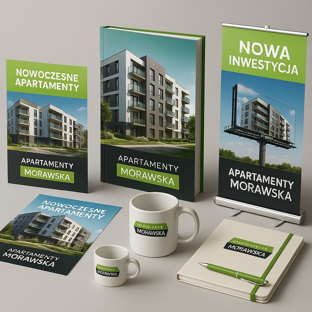
Define your brand – who you are and who you're for
Invest in a designer – not a $25 logo from eBay
Test with clients – which one did they remember after 5 seconds?
Final thought
A good logo doesn’t say “I sell apartments.”
A good logo says:
“I’m a professional you can trust.”
And that’s enough to earn your client’s attention.
Need a professional logo for your project?
Contact RendPro!
FAQ – Frequently Asked Questions about Real Estate Logos
1. What’s the role of a logo in real estate?
The logo is the first point of contact with the client. It builds trust, recognition, and a professional image.