If you are a real estate developer, you may be wondering how to create a logo for your company or property development that is perfect and easily memorable. To answer this question, take a look at the examples of well-known brands such as Nike or McDonald's.
When someone asks you to recognize the logos of these brands, you will probably be able to do so without hesitation. But what makes that simple "swoosh" or golden arches so recognizable?
When it comes to your property development, it's worth taking care of the logo design. According to an article published on crowdspring.com, a brand's logo has only 10 seconds to make a first impression. However, a customer needs to see the logo five to seven times to recognize it.
Your development's logo will distinguish your community, identify your values, can attract attention and leave a lasting impression. If you are a real estate developer involved in property development, you know very well how important it is to effectively design a property development logo. That's why you are in the right place! Here are our 6 tips for designing a property development logo that will help you attract the right customers and build a strong property development brand!
1. Maximize Simplification
It can be tempting to create a complicated and elaborate apartment logo because you think it will stand out in the market. But in reality, customers always respond positively to the "less is more" approach. They remember simple logos, and simple designs tend to stand the test of time.
Creating simple logos is more difficult because they practically tell the whole story of your brand through one very clear visual element. An example would be Apple's simple, clear logo in the shape of an apple - quite effective and memorable, right? So take the time to define exactly what is important to your brand identity and create a well-thought-out, clean design.
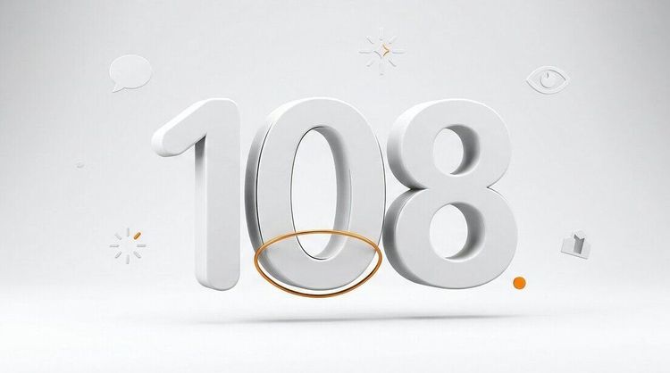
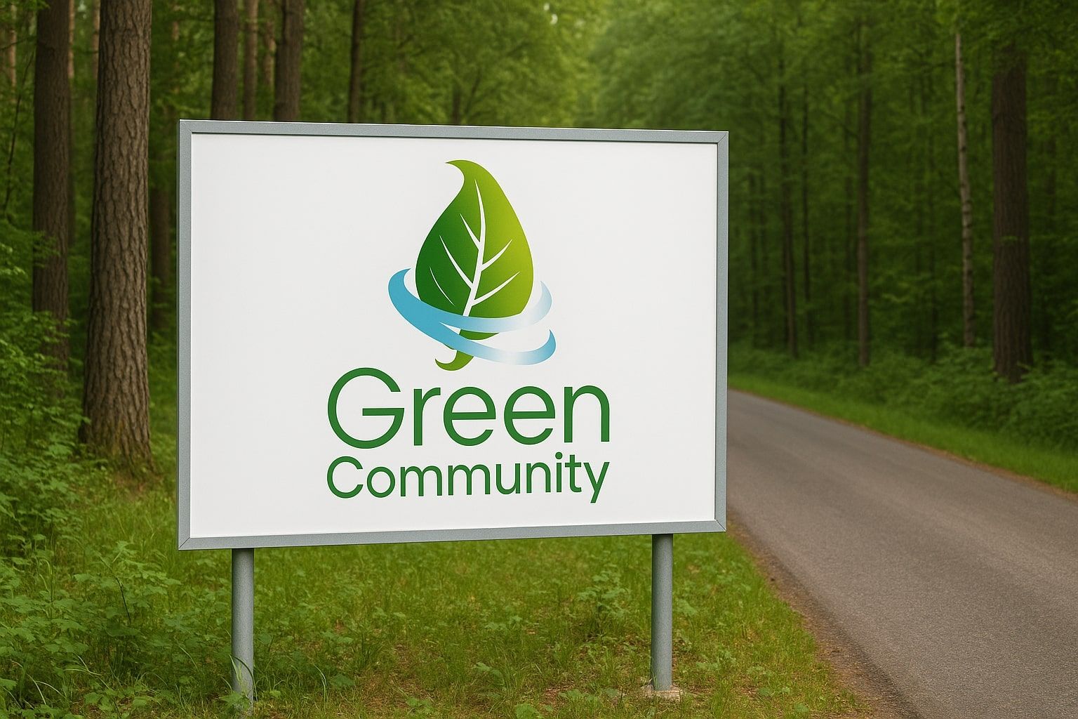
Examples of logos designed by RendPro:
![]()
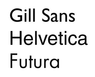
2. Choose the right Font
To start, think about what information you want to convey about your investment - should it be luxurious and exclusive, elegant and modern, or rustic and organic? Should the investment have the feel of a renovated townhouse or a modern skyscraper?
Once you've determined your style, choose a font that fits it. Legibility is key - don't go for overly fancy fonts that will make it difficult for the audience to receive the message.
It's a good idea to stick to one or two different font styles that will work well together. More styles can make the logo look disorganized and confusing (don't forget the first rule about logotype simplicity!).
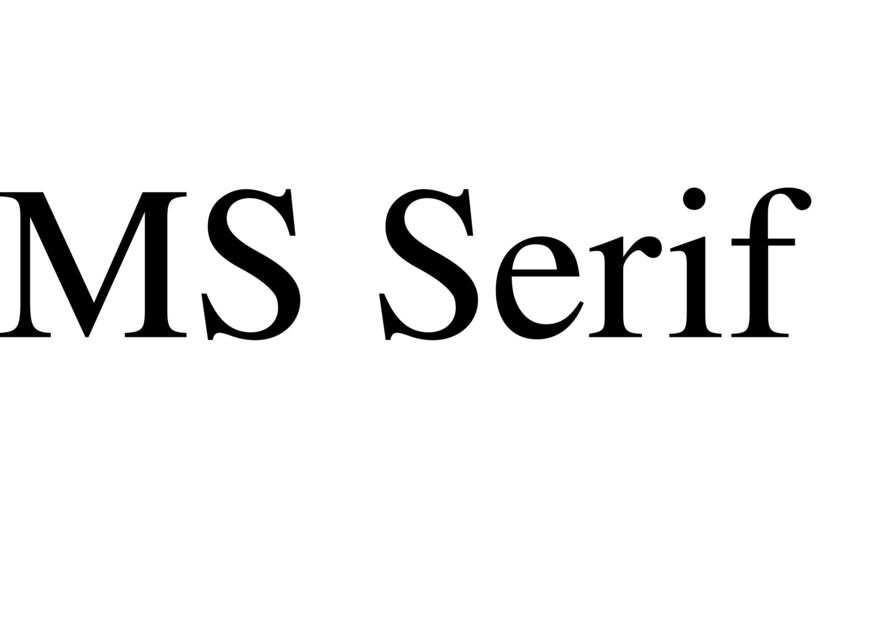
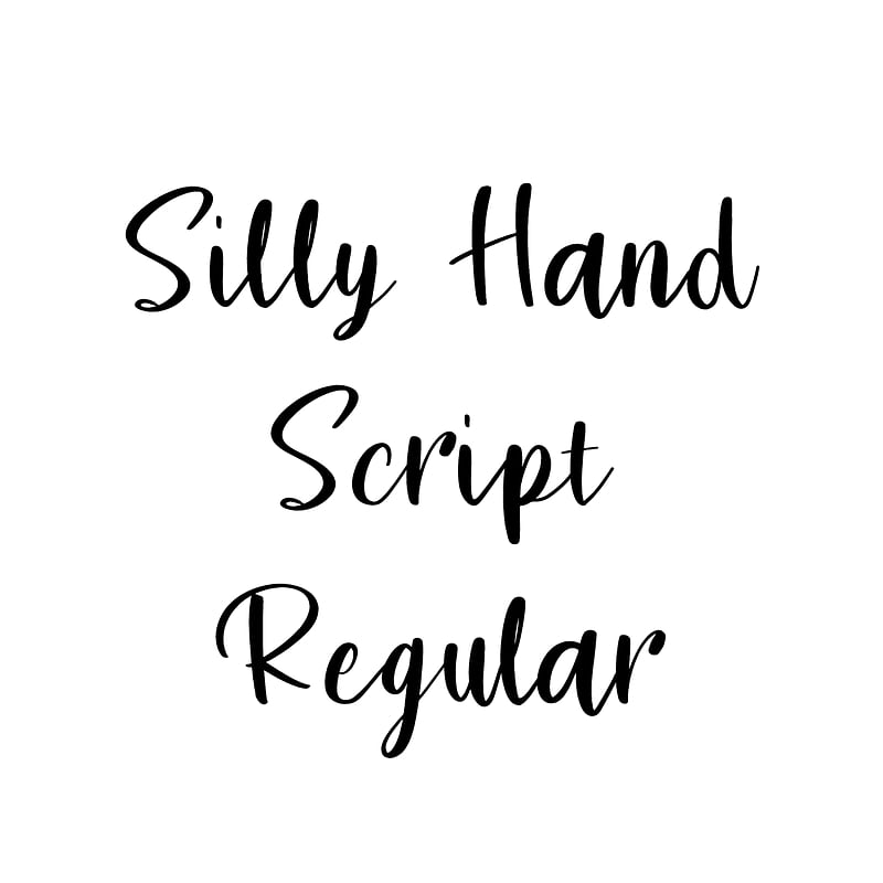
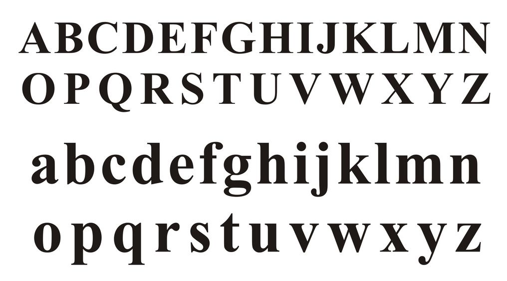
We also recommend using more traditional fonts instead of trendy ones. The main types of fonts include: Serif, Sans Serif, Display, Script and Modern. Each font style has its own psychology - that is, each style can evoke certain feelings or emotions in potential customers.
Here's a quick guide:
Serif: Traditional, respectful, trusting, comfortable
Sans Serif: Cleanliness, Modernity
Display: Friendliness, uniqueness, expressiveness, playfulness
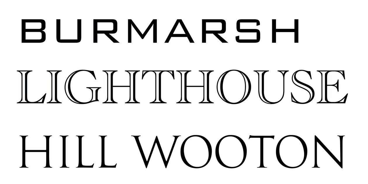
Script: Elegance, creativity, sensitivity
Modern: Strength, progressiveness, style
Based on the list above, choose those features that best describe your development, and then match the appropriate logo font for your development project.
3. Choose colors that will appeal to your customers

Don't choose a color just because you like it - it should also fit your brand and be visually appealing. Color is the first element that attracts potential customers and can improve the readability of your real estate development logo.
According to colormatters.com, 60% of people make brand choices based solely on color, and a distinctive color increases brand recognition by 80%.
For example, you can spot the red and gold letter M in the McDonald's logo or the green Starbucks logo from a distance, even driving on the highway, right?
It's important to remember that each color has its own meaning and evokes specific feelings and inspires specific actions in consumers. Study the psychology of colors and decide how you want potential buyers to react to your logo.
The most common colors used in logo designs are:
- blue,
- followed by red,
- black,
- and finally yellow.
You can take inspiration from major brands that use these colors or try something unique for your brand. Here's a quick guide to color psychology to consider when choosing the right color for your real estate development logo design:
- Red: Associated with energy, passion and power. It can evoke strong emotions such as love, anger or excitement.
- Orange: Symbolizes enthusiasm, joy and optimism. It is often associated with activity and vitality.
- Yellow: It is attributed with associations with joy, happiness and intelligence. It can attract attention and lift mood.
- Green: Associated with nature, peace and harmony. It is often considered the color of relaxation and repose.
- Blue: Symbolizes calmness, confidence and loyalty. It can help create a sense of trust and stability.
- Purple: Often associated with creativity, luxury and mystery. Can evoke feelings of prestige and elegance.
- Pink: Traditionally associated with femininity and tenderness. Can evoke feelings of tenderness and romance.
- Brown: Associated with down-to-earthness, ruggedness and naturalness. Often associated with warmth and security.
When designing a logo for a real estate development project, it's also a good idea to consider market trends. It is important to use colors that will remain relevant even in the future, regardless of passing trends (for example, neon pink was fashionable in the 1980s and has recently gained popularity, but how long will it remain popular?).
As a developer, you should limit the number of colors in your logo to a maximum of three, although we strongly recommend focusing on two. The most successful logo designs are often based on a minimalist approach that fits in with the aesthetics of modern developments.
With the real estate development industry in mind, we want to create a logo that represents the investment in an attractive and professional manner. Choosing the right colors is important, as they can affect the emotions of potential customers and create positive associations with our brand.
4. Add a symbol to your logotype
Humans process visual images faster than text alone, which is why so many logos include symbols or characters along with the brand name. Some larger brands even dispense with text and use only the symbol (like Apple). In today's digital world, symbols are especially important for effectively communicating the core message to our audience.
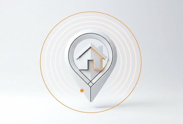
Examples:
![]()
5. Don't forget the sign book or brand book
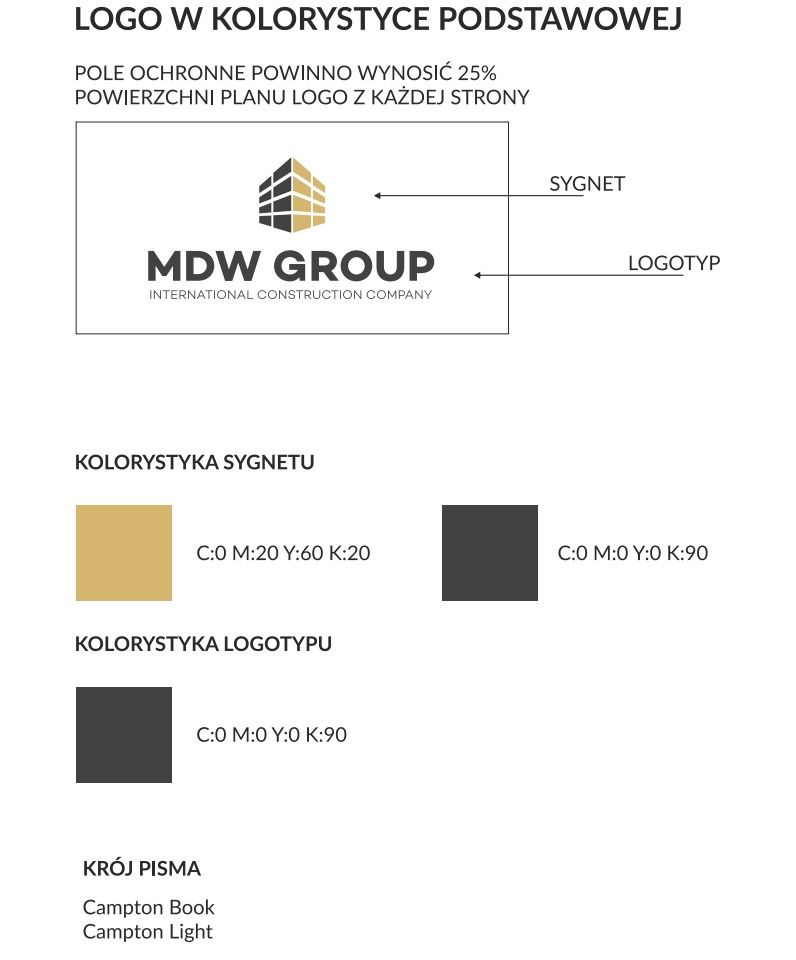
A logo book or brand book of logos will contain all of the pertinent details of your real estate development logo, so you can ensure consistency of message in all of the marketing materials you create. This guide will include the pantone colors used, the exact size specifications, the fonts used, and other relevant details about the logo. You will then be able to pass this guide on to any designer, and he or she will be able to perfectly reproduce the logo's color scheme in the material in question.
6. Final tip: hire an expert
Your real estate development's logo is arguably the most important part of building your brand identity. All of your future marketing efforts will be based on it, so it's important to get it right from the start (no excuses!).
Contact us, we'd be happy to create a logo for your real estate development project!
FAQ - Property Development Logo
1. Why is creating a unique logo so important for a real estate developer?
A logo is the brand’s business card – it differentiates it from the competition and builds recognition. In the real estate industry, where trust and professionalism are crucial, a unique logo emphasizes credibility and the prestige of the investment.