50 Real Estate Project Names - from Around the World
...
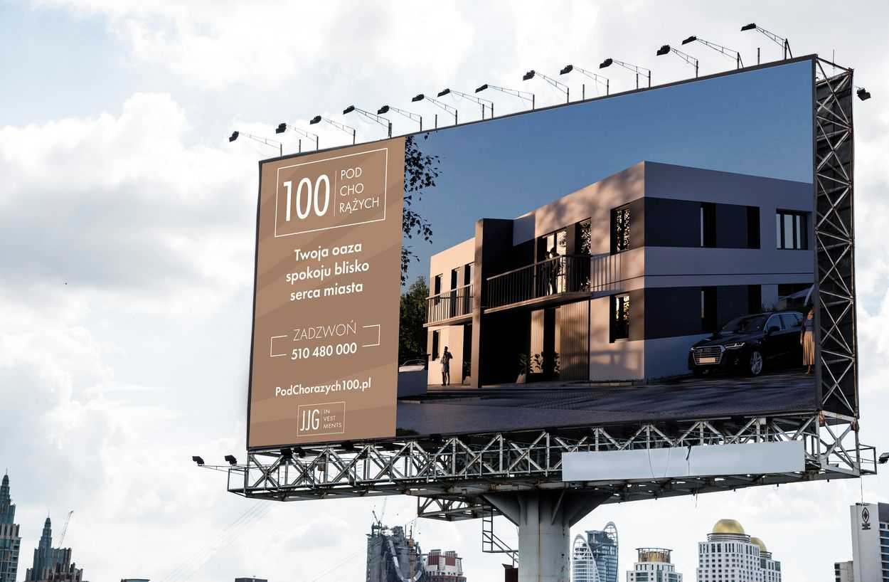
Whether you are marketing your property development in favorable economic times or in times of recession. A banner and billboard are always a great tool to promote your property development in the offline world.
If you're using online tools to promote your investment and you're wondering if it's worth investing in "stand-up" ads. The answer is: it is worth it, and very much so.
In our opinion, a developer's marketing efforts should complement each other in the online and offline worlds.
Not using online promotion tools yet?
Check it out and see what results you can achieve - Online Marketing Campaigns.
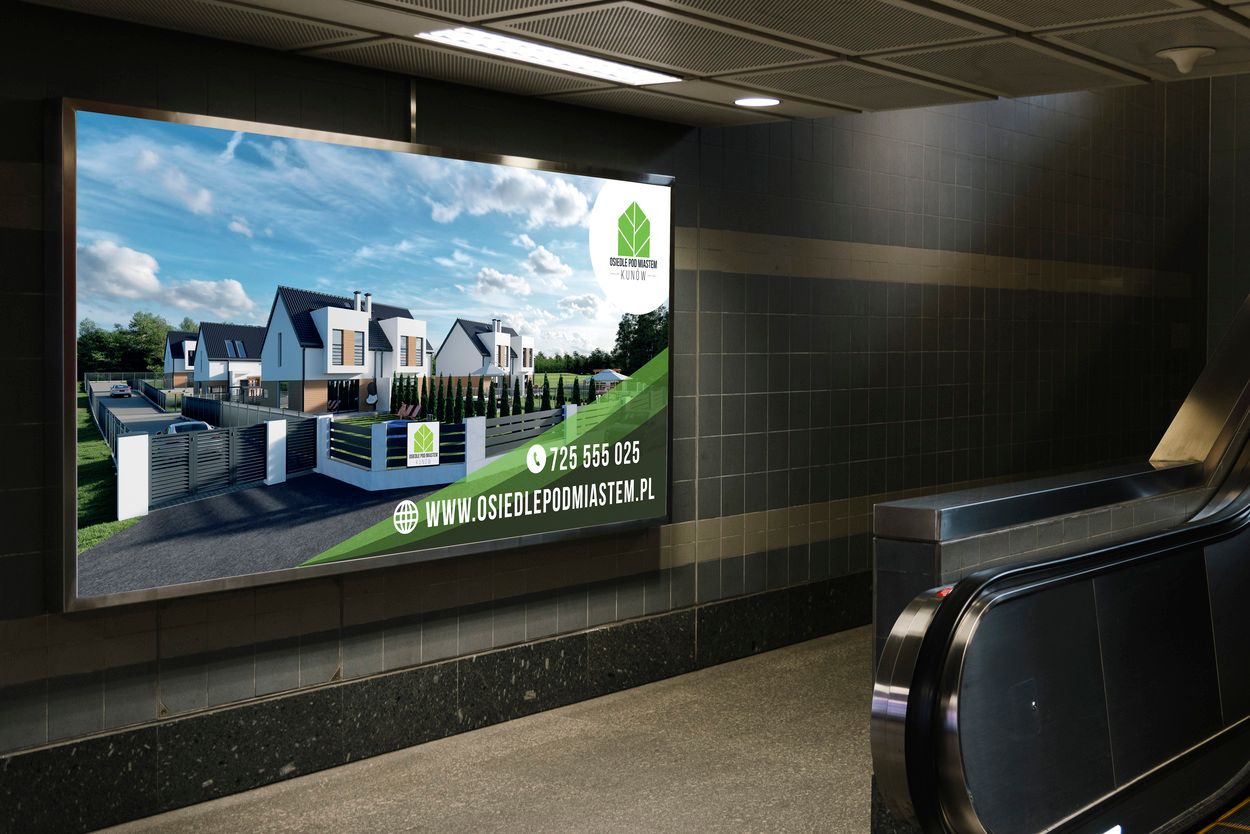
A banner allows you to showcase your property development in a quick but attractive way.
Outdoor ads target passing motorists and passing pedestrians. These people will only look at the billboard for a brief moment, so they won't have time to carefully analyze the entire banner or billboard of the development. Therefore, any outdoor advertising must be attractive and engaging enough to hold people's attention for such a small interval of time.
It is a form of marketing that builds awareness in your potential customers.
That is to say, it is the banner that makes people living in the city where you are making the investment or the surrounding largest city - learn about your property development project.
The more people learn about your investment, the better.
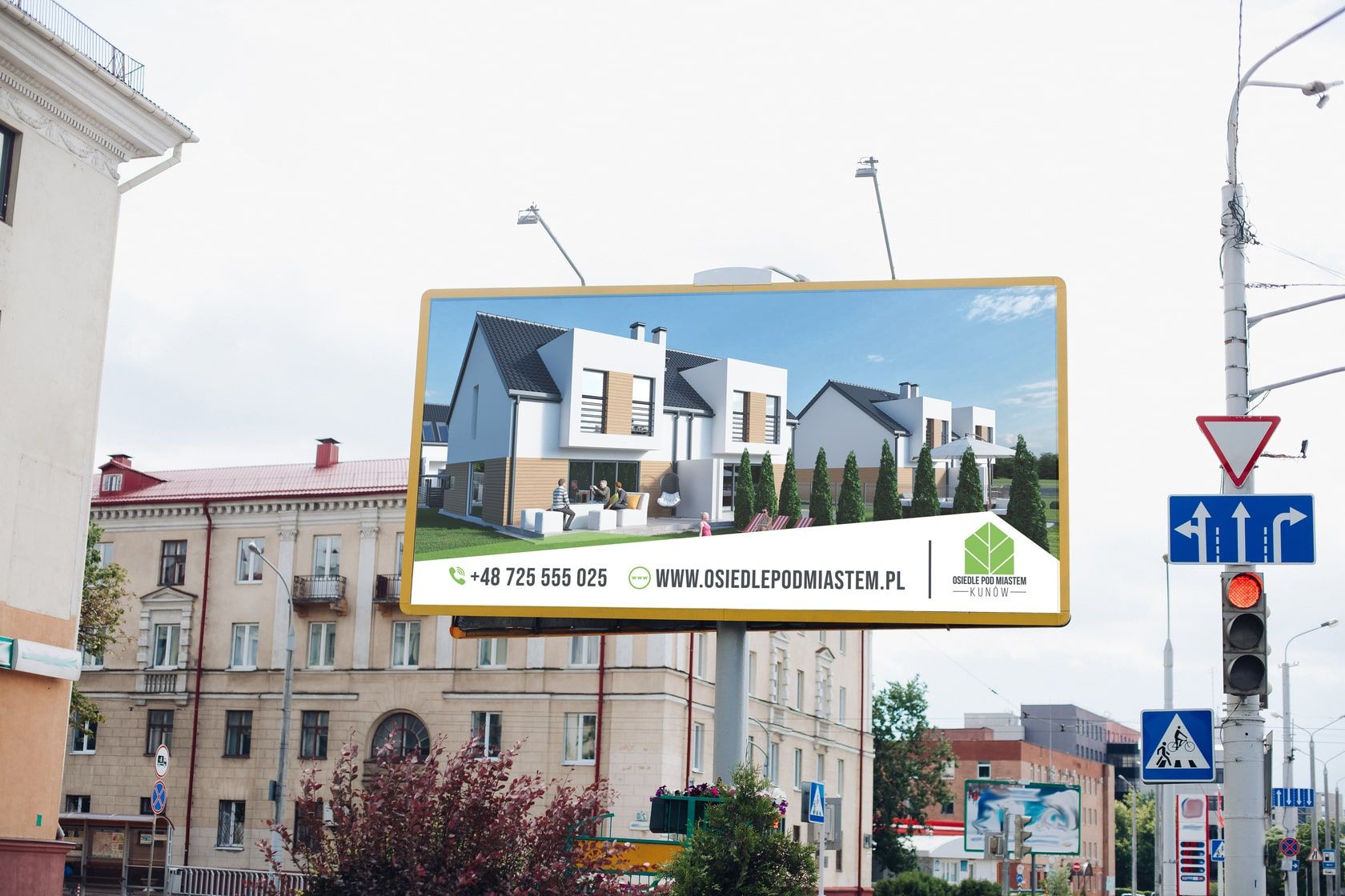
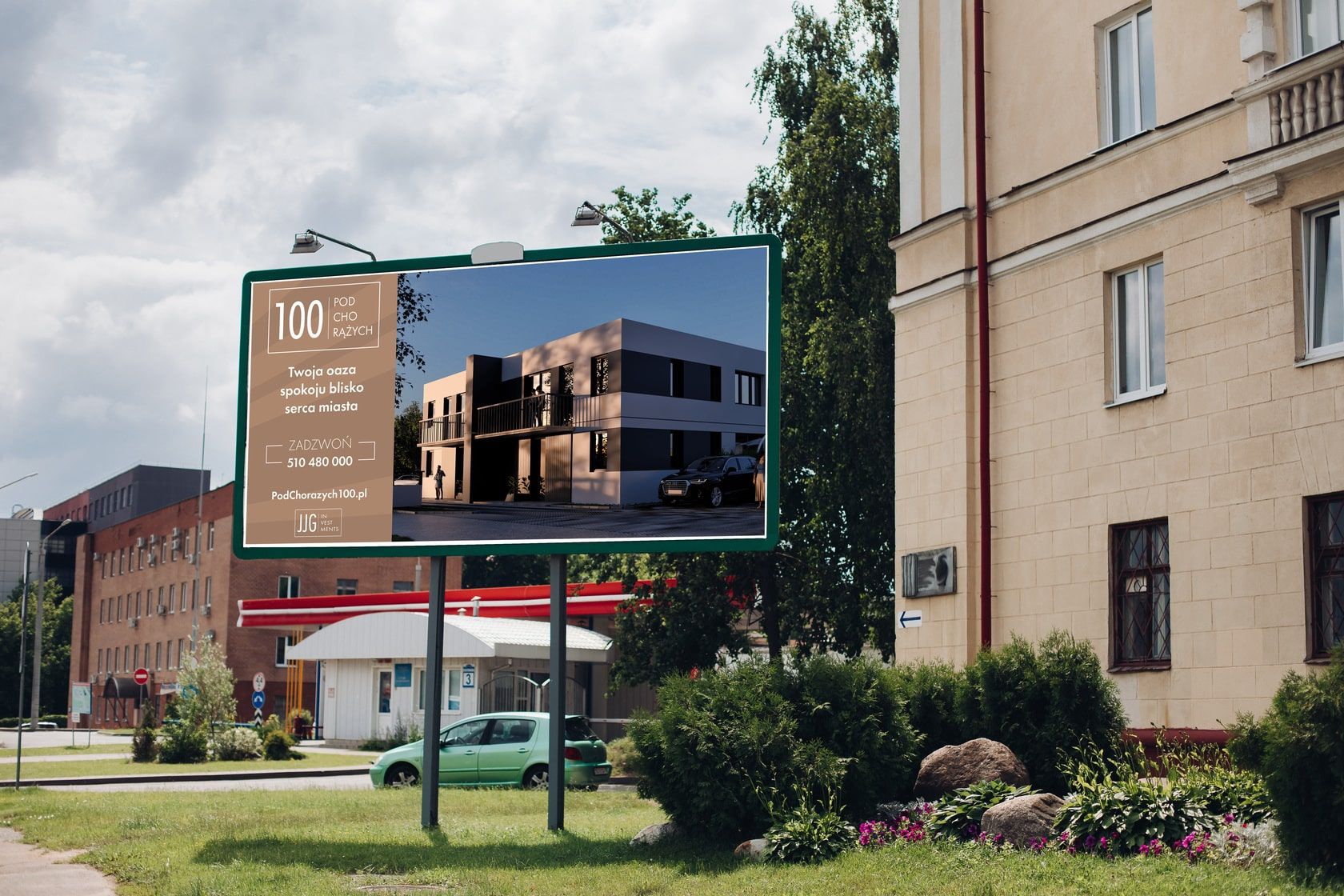
Banner, billboard or tarp - any advertising space that the developer "rents" should include a photorealistic 3D visualization.
Just one 3D visualization that is photorealistic and, according to the design company, will achieve the best results.
When this blog post is written it is 2022. The times have come where photorealism is a necessity. It is not enough to create a "quick and simple vision" and put it on a banner.
You never put a bird's-eye visualization or a drone photo on a banner. These two graphic forms give away too much information and, in our experience, hurt you more than help you sell.
The purpose of a banner is to attract attention. Only when a potential customer sees your banner 1 or 2 times, is there a greater likelihood that your creative will prompt the recipient to take action - a CTA - that is, to go to your website/call you or your sales team.
It is worth ensuring that such elements as the name of the development, the address of the page, the color scheme are consistent. This will help the developer achieve the best results.
The banner should consist of as little information as possible. 2-3 data that are the most important are enough.
We always recommend our clients to include 2 data on the banner:
- logo of the investment,
- address of the investment website,
- Optionally, a phone number.
The less data the better. The above 2 elements are the most important and should be included on every banner.
What you should care most about is that your recipient interested in your project goes to the investment page.
This way, the company that is marketing your investment online can use this information to remind that person of your offer.
This is very useful, especially when the buying process in the development industry takes so long.
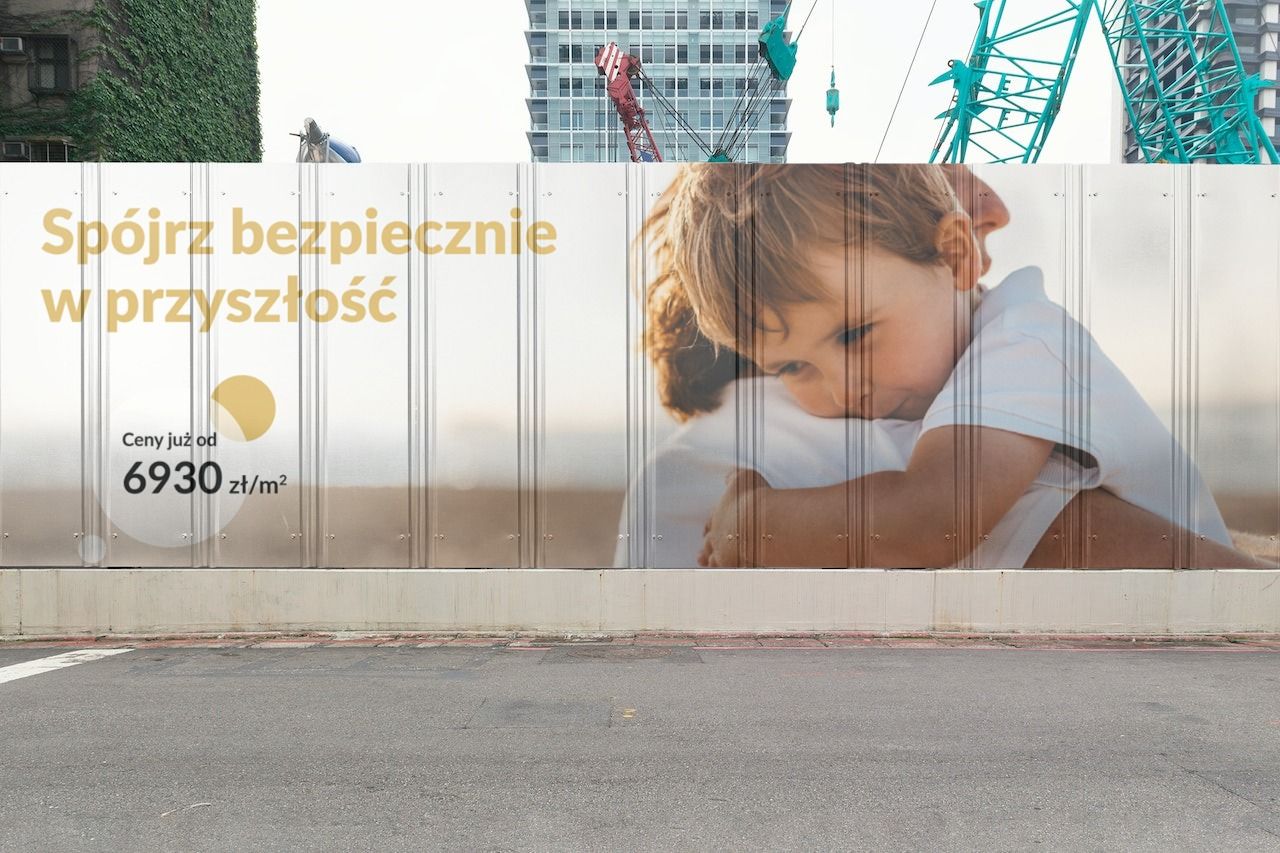
It is worth hanging a banner on the fence of the development. This is a popular solution. Sometimes still at the stage when only the logo of the property development is ready. Without visualization. This procedure, builds curiosity in the viewer.
In addition to the standard banner on the fence, it is worth investing in a banner that will be visible to a much larger audience.
It is worth investing in advertising space close to highways, expressways, the most frequently used intersections and the most popular routes.
The choice of location also depends on your target customer.
It's worth thinking carefully about your choice of location before buying space.
If your investment is aimed at a family with children, why not choose a banner close to a school / kindergarten / high school? Think about it.
What is behind the advertising space?
Blue sky or bushes? Or maybe the banner hangs between other banners.
This is very important information. Sending photos of the banner surroundings and the billboard, will allow us to create a graphic design in such a way that your banner stands out and catches the eye, even when there are other banners next to it. Even competitors.
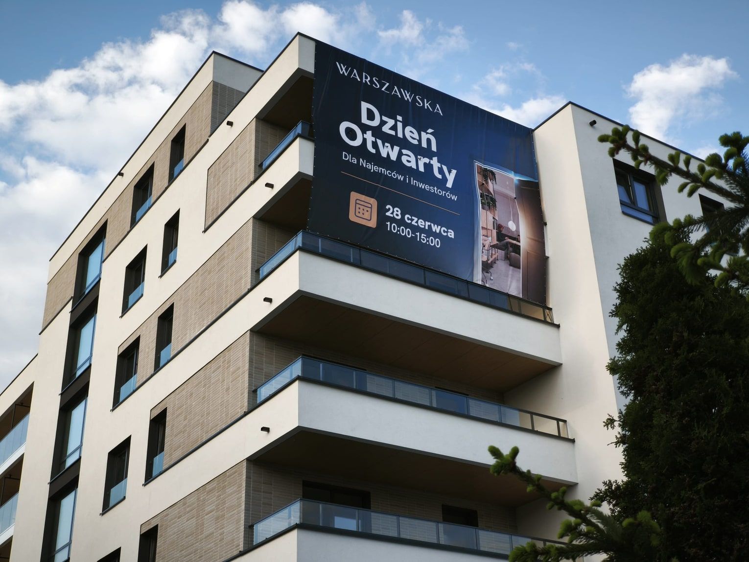
The dimensions of the billboard and banner may vary depending on the location of the advertising space and the pre-imposed requirements and your preferences as a real estate developer. However, the advertising industry uses certain standards.
Below are popular sizes:
4x8 ft: This size is quite common and offers good outdoor visibility. It can be placed at the entrance to a new development, construction site or real estate developer's office.
3x6 ft: More compact than 4x8 ft, but still providing enough space for project information. Often used on construction site fences or at project entrances.
2x6 ft: Longer and narrower banners that can be placed on a fence fence or building wall. They are suitable for displaying important information.
5x10 ft: This size is larger and can be used if a real estate developer wants a more impressive and visible banner, such as for large residential projects.
8x10 ft: A large banner that can be used to advertise larger areas of real estate, complexes or new communities.
The price per square foot of banner can vary significantly depending on a number of factors, such as the type of material, the dimensions of the banner, the number of banners ordered, the location and additional options such as lamination and design services.
For an accurate quote, we suggest contacting us or a printer in your area. You can request a quote by providing the full specifications of your project, which we discuss in the section below.
1. Gathering information - brief.
Determining the specifications of the banner: such as dimensions, resolution of graphics, material on which the banner will be printed and the place where the banner will be mounted
2. Selection and preparation of 3D visualization of the investment.
On the basis of 3D visualizations prepared by us or received ready-made files, we select the best visualizations for the banner, and then prepare high-resolution visualizations for printing in a larger format. This provides us with the best possible quality of 3D visualization on the banner - visible amount of detail, sharpness and realism of the render.
3. Graphic design preparation.
Creating the graphic design of the banner in a graphics program such as Adobe Photoshop, Illustrator or other.
Sending banner proposals to the real estate developer and final selection of the best option.
4. Preparing the banner design for printing.
Converting the design to the appropriate printing format, e.g. CMYK.
Applying the appropriate color and color space settings according to the printer's requirements.
Adding a safety area and a cut-off area so that we can be sure that important elements of the design will not be cut off during the printing and mounting process.
5. Sending the file to the printing house.
Delivering the finished file to the printing house. File with the finished banner, prepared for the requirements of the printing house.
6. Printing and production.
Printing house take care of everything.
7. Delivery and assembly.
Delivery of the finished banner to the customer for self-assembly or to a company engaged in the rental of advertising space and installation.
An essential element of a banner is 3D Visualization.
Too often I see banners in cities where the visuals are slightly blurry, out of focus, too dark or too bright.
Make sure that the creation of the banner design and visualization 3d is handled by 1 company.
We help you choose the printing technology, the dimensions of the banner, visualizations and advise you on an ongoing basis.
The process of creating an effective banner, is much more complicated and time-consuming. It is worth trusting a company that has been doing such projects for years and specializes in your development industry.
Yes, they do — especially when combined with online campaigns. They build local awareness and support sales, especially within a few kilometers of the property investment.
It builds brand recognition, grabs attention, enhances trust, and supports online activities such as remarketing.
A photorealistic 3D visualization (not an aerial view), logo, property website address, and optionally a phone number. Simplicity is key.
On the property’s fence, along busy roads, intersections, transport hubs, near schools and residential neighborhoods.
A banner alone won’t close a sale, but it can effectively drive traffic to the website where online actions convert it into leads.
Too much text, poor graphic quality, lack of branding consistency, no CTA or unreadable CTA.
Yes — less competition and higher visibility make outdoor even more effective than in large cities.
At least several months — from construction start to the end of sales. Continuity builds trust and supports online efforts.
Yes — they are effective as digital support. They create a consistent, multi-channel marketing ecosystem.
Through website traffic, unique URLs, QR codes, increased phone inquiries, and leads from remarketing.
Yes — they simplify redirection to landing pages and help track offline campaign performance.
Large-format billboards, fence banners, and roll-ups in sales offices.
Yes, especially if you're targeting clients commuting from other regions. The reach and visibility are massive.
Contrasting colors, large fonts, photorealistic visualizations, and concise slogans.
Absolutely — integrating with Google Ads, Facebook, or email increases ROI and overall strategy effectiveness.
Book a free consultation.
Sign up now for our free RendProletter and receive 1 email every week with a short summary of the best posts from our blog and emails with unique offers you won't find anywhere else!
