


3D Visualizations
3D Visualization of a Building, House - Price & Realisation Time
...
3D solar farm visualization helps developers present projects clearly, win investor trust, and speed up decisions with realistic, high impact visuals.
3D solar farm visualization is one of the fastest ways to make a project easier to understand, easier to sell, and easier to move forward.
You have the land.
You have the concept.
You may already have grid capacity, or you are close to that stage.
Then the real issue shows up.
How do you present the project so investors, landowners, municipalities, and partners instantly understand the scale, layout, and value?
Site plans and technical drawings matter.
At the same time, they rarely create a clear picture in someone’s mind.
That is exactly why 3D solar farm visualization has become such a strong tool for project development, investor communication, and marketing.
I see the same problem over and over again.
A project can be financially solid, technically sound, and well located.
Still, the presentation often fails to reflect its real value.
That matters because decisions are not made on spreadsheets alone.
People decide faster when they can actually see what the project looks like.
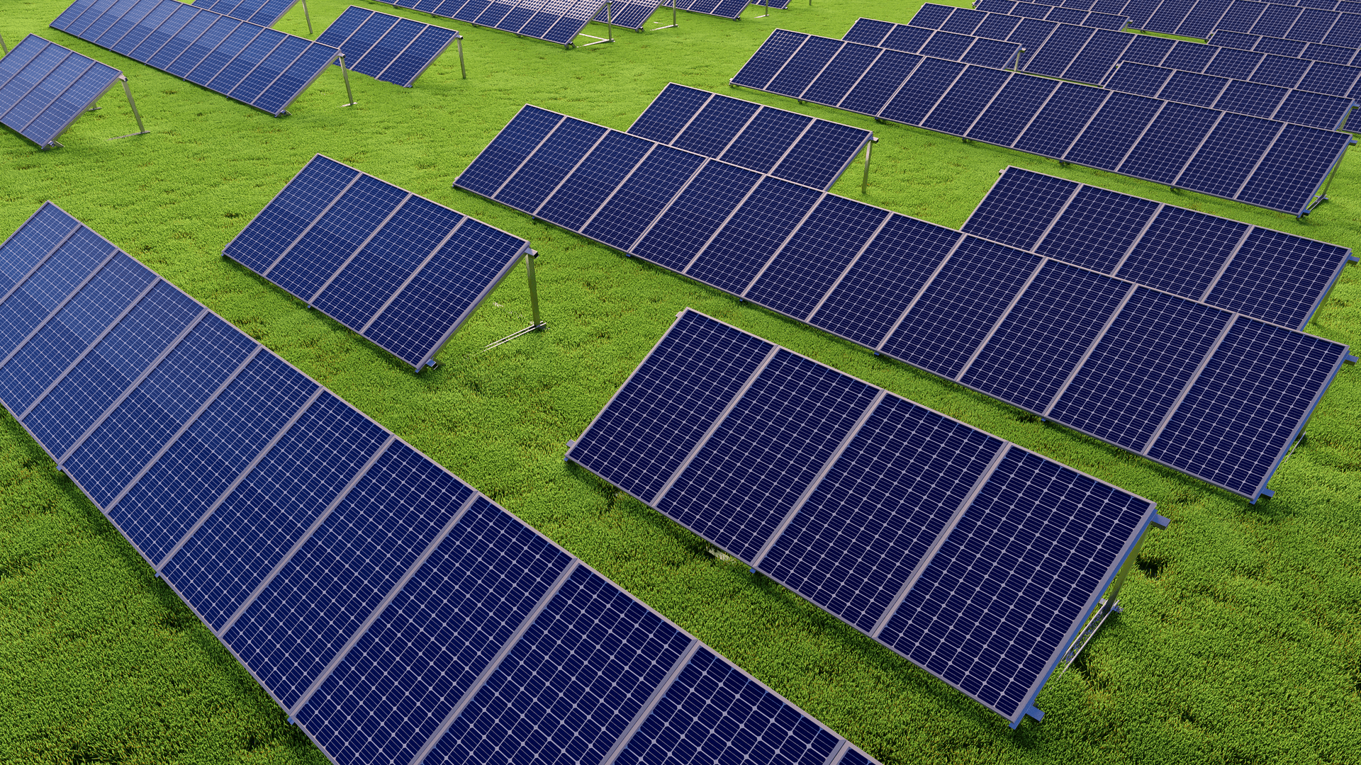
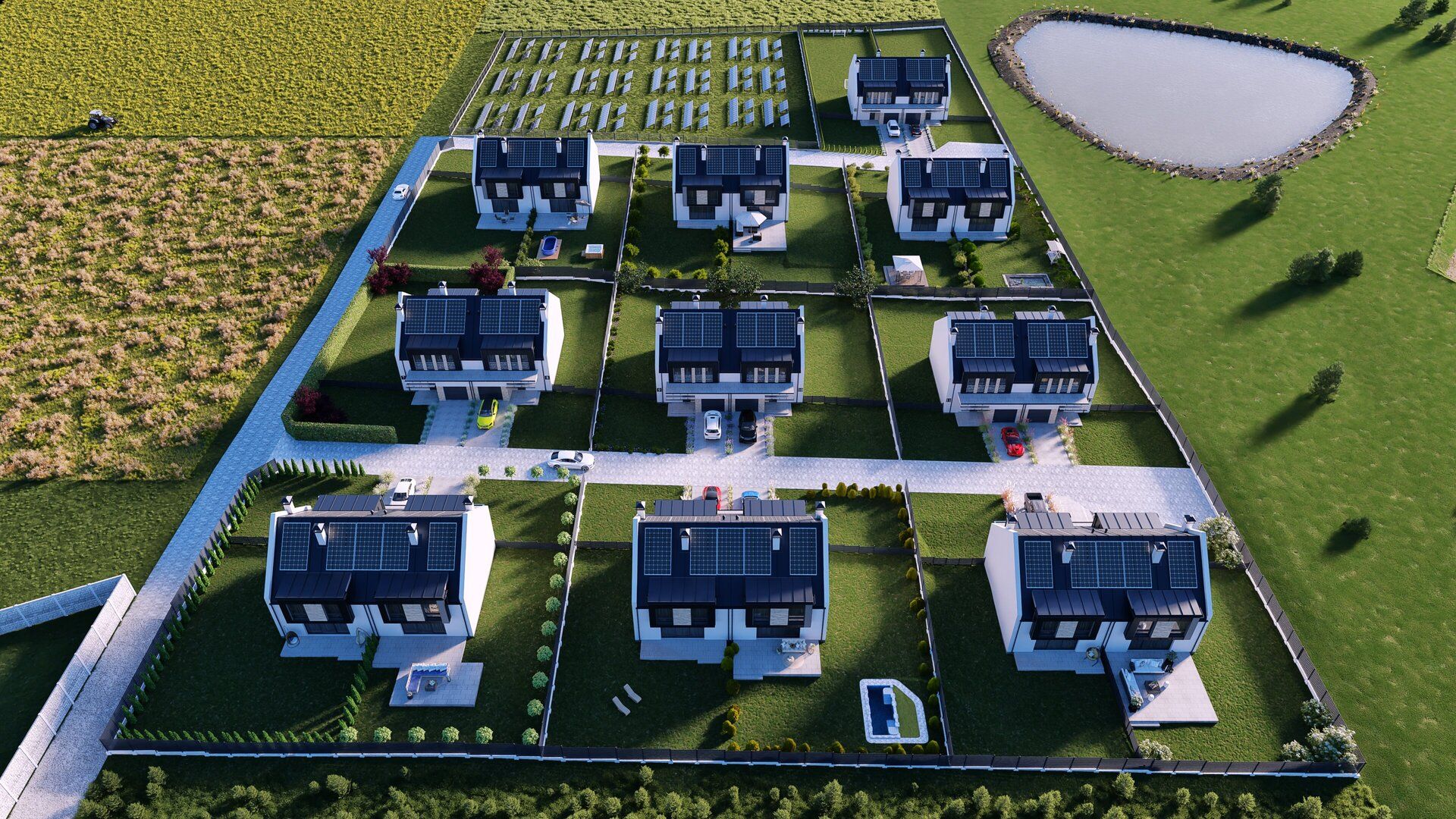
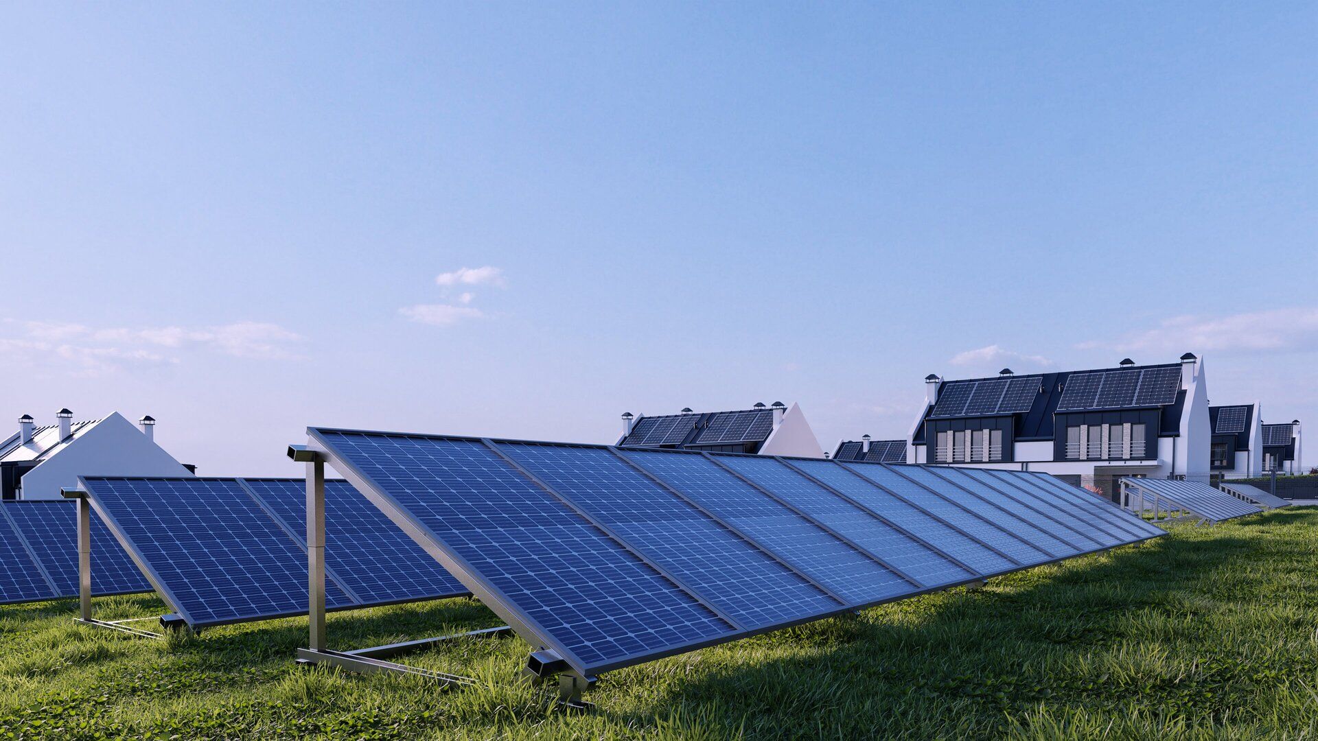
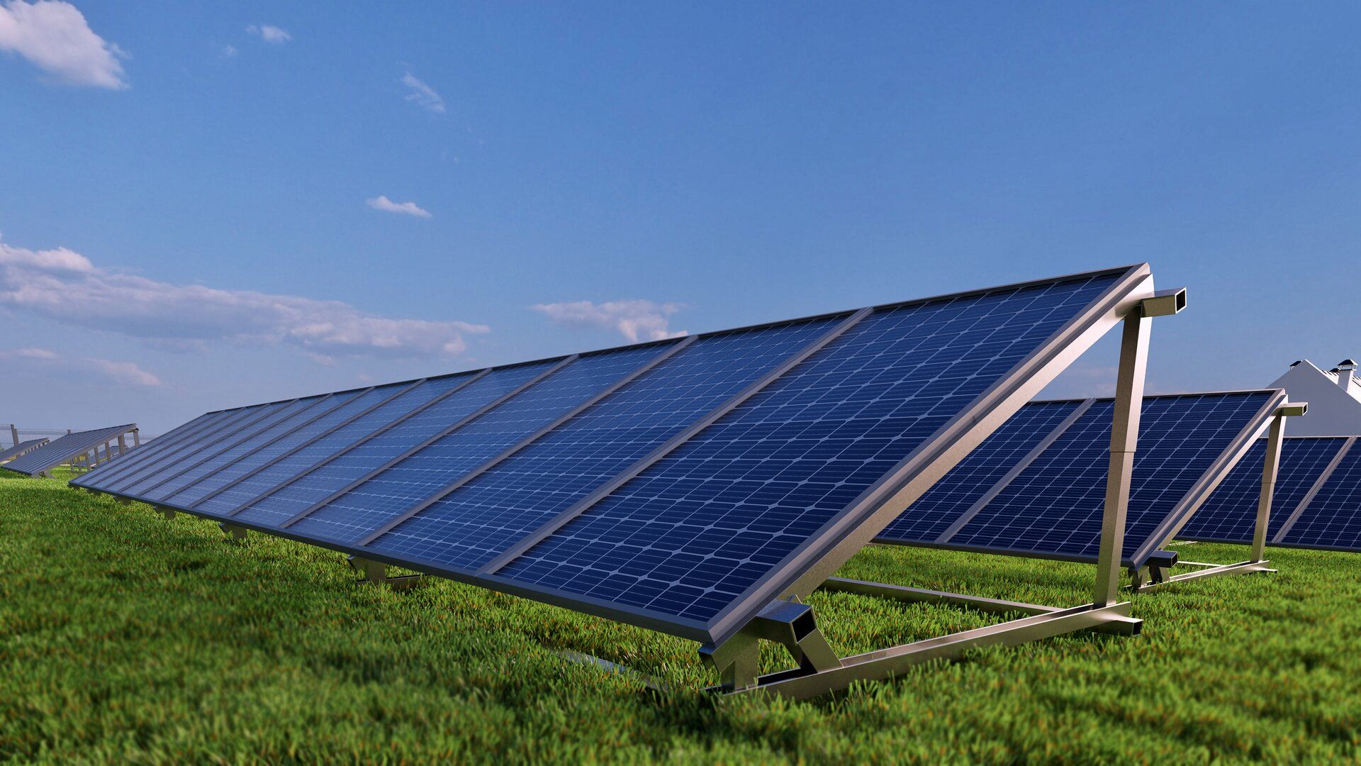
A strong 3D solar farm visualization shows the real layout of the panels, the service roads, the fencing, the transformer area, and the relationship between the site and its surroundings.
It also helps people understand the scale from both aerial views and eye level views.
Because of that, the project becomes easier to trust.
The biggest mistake is treating visualization like an extra.
It is not an extra.
It is a business tool.
From my perspective, 3D solar farm visualization gives developers four clear advantages.
Investors want more than power capacity numbers and financial assumptions.
They want to understand the land use, the site logic, the visual quality, and the overall maturity of the project.
When you show realistic renders, aerial perspectives, and well chosen scenes, you make the project feel more real and more investable.
If you are selling a ready to build or late stage solar project, presentation quality matters.
A clean and realistic 3D visualization can make your offer stand out immediately.
It can also improve your teaser, investment memorandum, website, and pitch deck.
That matters because buyers often compare multiple projects at the same time.
Not everyone reads technical drawings well.
Municipalities, landowners, neighbors, and business partners need something more intuitive.
A 3D solar farm visualization makes communication easier because it removes guesswork.
People stop imagining the worst and start reacting to something concrete.
One strong visualization can work across many channels.
You can use it on your website.
You can place it in your investor deck.
You can include it in your sales materials.
You can also use it in digital campaigns, press features, and social media content.
That means one asset can support several business goals at once.
A pretty image alone is not enough.
If the visualization is supposed to support real business decisions, it needs to show the right things.
A good 3D solar farm visualization should include the panel layout, inverter stations, transformer units, internal roads, fencing, access points, terrain shape, vegetation, and nearby buildings.
It should also show the project from multiple angles.
Aerial shots help explain scale.
Ground level views help explain impact.
This is especially useful when the project needs to be presented in several rounds of approvals, investor meetings, or public communication.
This is where visualization becomes truly valuable.
It does not sell fantasy.
It reduces uncertainty.
And the less uncertainty there is, the faster decisions happen.
An investor usually wants answers to simple questions.
Is this project well planned?
Does the land use make sense?
Does it look professional?
Can I take this presentation to my committee, management team, or financing partner?
A clear 3D solar farm visualization answers those questions without forcing everyone to decode a technical package.
That is why it works so well in project sales, due diligence support, and financing discussions.
A good process saves time.
A bad one creates endless revisions.
Most 3D solar farm visualization workflows follow four stages.
This usually includes the site plan, project concept, technical assumptions, layout drawings, equipment references, and site photos.
The better the inputs are, the stronger the final result will be.
At this stage, the solar farm and its surroundings are turned into a digital model.
This is where the project starts to look like a real asset instead of a concept on paper.
This stage is often underestimated.
In reality, it has a huge impact on how persuasive the final material will be.
The right scenes should support the goals of the presentation.
Some views are better for investors.
Others work better for local communication or website use.
At the end, the team produces final images, animations, or short flythrough videos.
Depending on the goal, the output may include still renders, presentation visuals, website graphics, and social media assets.
Imagine two similar solar farm projects.
Both have similar capacity.
Both are at a solid development stage.
The first one is presented with a map, a table, and a few technical screenshots.
The second one includes a polished 3D solar farm visualization, aerial views, road side perspectives, and a short animation.
Which one gets remembered faster?
Which one looks more prepared for serious capital?
Which one is easier to move through internal decision making?
The answer is obvious.
This part is often overlooked.
Then resistance shows up later.
People tend to worry about what they do not understand.
That is why visual communication matters so much.
A 3D solar farm visualization can show how the project fits into the landscape, how far it sits from neighboring plots, how high the structures will be, and whether the development dominates the area visually or stays relatively neutral.
That creates calmer and more productive conversations because people are responding to a visible concept instead of assumptions.
A lot of companies leave value on the table here.
If you are already creating the material, it makes sense to use it everywhere it can support growth.
That includes project sales packs, investor teasers, memorandums, landing pages, bank presentations, municipality meetings, trade fairs, and PR content.
Because of that, I see 3D solar farm visualization as an asset, not a cost.
Yes, because even an early visualization can make the concept easier to explain and easier to position.
Yes, because it makes the project easier to understand and gives the offer a more professional feel.
Usually, you need a site layout, technical assumptions, reference materials, and information about the land and surroundings.
Yes, and that is one of the best use cases because it turns a technical project into something people can understand quickly.
Yes, which is exactly why it delivers so much value when planned correctly.
In renewable energy, the best project does not always win first.
The project that is easiest to understand often moves faster.
That is why presentation quality matters.
When a solar project looks clear, credible, and investment ready, conversations become easier and decisions happen faster.
For me, that is the real value of 3D solar farm visualization.
Book a free consultation.
Sign up now for our free RendProletter and receive 1 email every week with a short summary of the best posts from our blog and emails with unique offers you won't find anywhere else!


