Is it worth creating a logo for a construction company?
If you are the owner of a construction company, you may be wondering how to create a logo for your company that is perfect and easily memorable. To answer this question, take a look at the examples of well-known brands such as Nike or McDonald's. When someone asks you to recognize the logos of these brands, you will probably be able to do so without hesitation. But what makes that simple "swoosh" or golden arches so recognizable?
When it comes to your construction company, it's worth taking care of the logo design.
According to an article published on crowdspring.com, a brand's logo has only 10 seconds to make a first impression. However, a customer needs to see the logo five to seven times to recognize it. Your company's logo will differentiate your business, identify your values, can attract attention and leave a lasting impression.
As the owner of a construction company, you know very well how important it is to design an effective company logo. That's why you're in the right place! Here are our 6 construction company logo design tips to help you attract the right clients and build a strong construction company brand!
1. Your industry and Your values
Creating a logo for a construction company requires understanding the specifics of the industry and the values the company represents. Start with a thorough analysis of the construction sector, paying attention to the unique characteristics that set it apart from others. Your logo should reflect the reliability, dependability and professionalism that are characteristic of the construction industry.
When analyzing the industry, it's also a good idea to look at your competitors to avoid similarities and create something truly unique. Company values, such as commitment to quality, innovation or sustainability, should be an integral part of the logo design. Remember that a logo is not just a graphic mark, but also a communication tool that should clearly represent the mission and philosophy of a construction company.
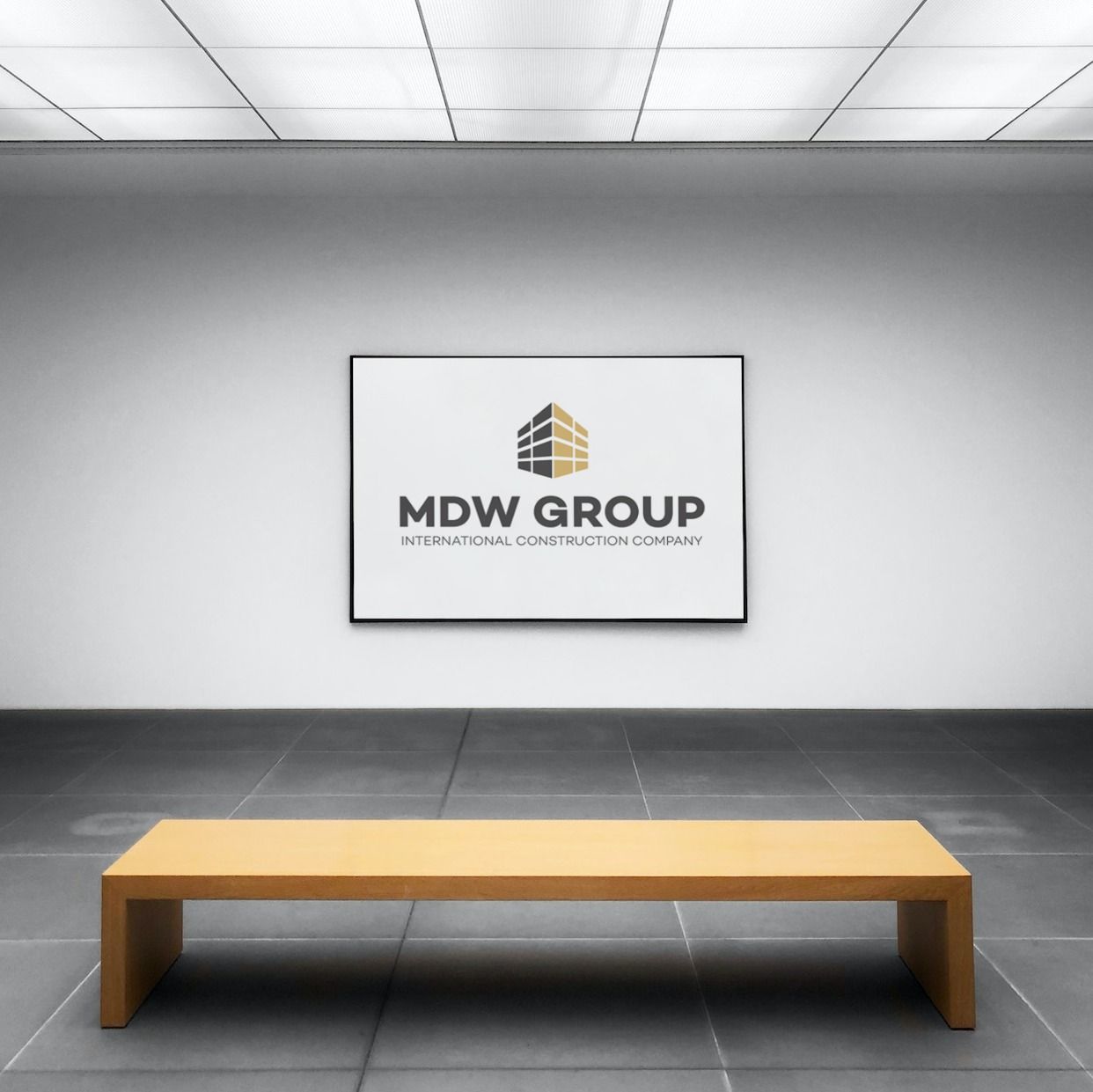
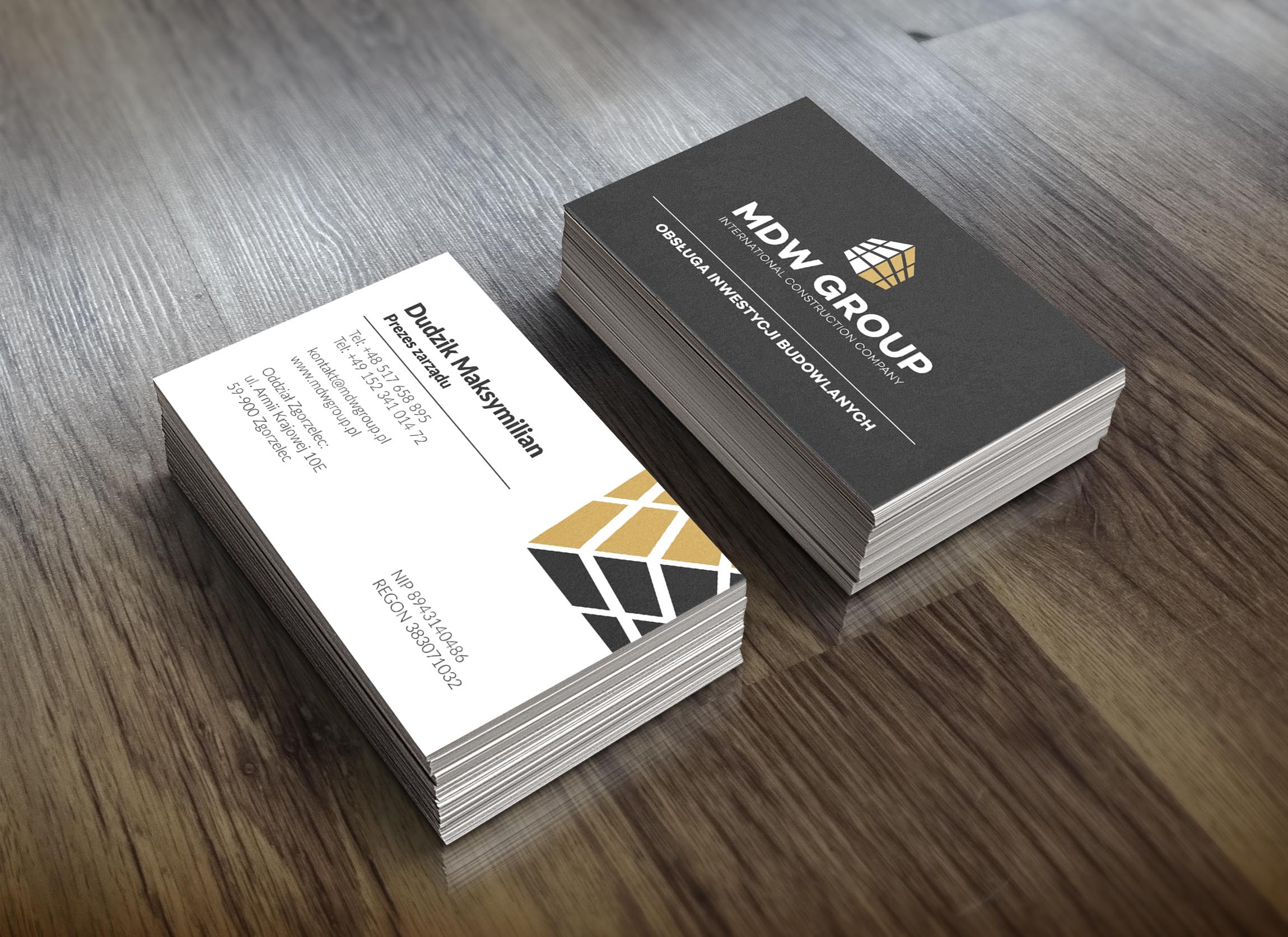
An example of a logo designed by RendPro Limited for MDW Group Sp. z o. o. :
2. Simplicity and legibility of the construction company logo
In designing a logo for a construction company, the most important thing is to make it as simple and clear as possible. The logo must be unambiguous, easily recognizable and understandable to different target groups, which is crucial for building brand awareness among customers. Avoid excessive details, complicated shapes and too many graphic elements that can make the logo difficult to remember and recognize....
Simplicity in logo design does not mean triviality, but can emphasize the elegance, reliability and professionalism of a construction company. The legibility of a logo is crucial not only on a website or business card, but also on billboards or billboards. A simple design ensures that the logo will be effective and efficient in all conditions and formats, guaranteeing a lasting impression among the audience.
3. Color scheme of the logo
Choosing the right color scheme for a construction company's logo is crucial for effective communication with the public. Colors can convey specific associations and emotions, so it is important to adapt them to the industry context.
Earthy tones such as deep browns, warm beiges, greens and blues are often used in the construction sector. Green can symbolize sustainability, nature, as well as freshness and modernity. Browns can be associated with solidity, stability and tradition, while blue referring to the sky can introduce an element of confidence and professionalism. When choosing colors, it is also important to consider the psychology of colors and its impact on perception.
The right color scheme will not only distinguish the logotype, but also build positive associations with the construction brand, which is crucial in the process of building brand awareness and customer trust. For example, Poland's largest construction company, Budimex, opted for a very minimalist logotype in yellow-orange, which is typically associated with the construction industry. Other frequently used colors in construction logos include blue, yellow, dark red and bright orange.
However, it is important to remember that the choice of color should be consistent with the company's values and the emotions it wants to evoke in its audience. For example, yellow is a warm, positive color associated with optimism, sunshine and happiness, but in some cases it can also be associated with warning.
When choosing a color scheme, it is also worth keeping in mind that it should be consistent with other elements of the company's corporate identity, such as the construction company's website, advertising materials and employee uniforms.
In conclusion, the choice of color for a construction company's logo should be carefully considered, taking into account the industry context, color psychology and the specific values and messages the company wants to convey.
4. Elements related to the construction industry
The inclusion of apt graphic elements related to the construction industry is key to an effective logo. These graphic elements should not only be visually appealing, but also clearly convey the specifics of your business. Consider adding symbols related to construction tools, building outlines, structures or other structural elements.
Graphic symbols should be consistent with the company's character and values. For example, if the company focuses on green building, the graphic element could refer to sustainable architecture or eco-friendly materials. On the other hand, if the company specializes in the construction of modern structures, the graphic elements can refer to modern design and innovation.
Avoid over-complicating the design; instead, focus on one or two graphic elements that best convey the nature of the construction company and are easily recognizable.
5. Scalability of the logo
Scalability and adaptability of the logo are key to ensuring consistency across different contexts and formats. A logo should look good on small business cards as well as on large billboards or websites. For this reason, it is important to design the logo in such a way that it remains legible and aesthetically pleasing in different sizes.
When designing a logo, it's important to check that details don't get lost when reducing the size and that the overall design remains legible. A simple form and clear lines help maintain consistency at smaller scales. In addition, make sure the logo looks as good in color as it does in shades of gray, which can be important in situations where color is not available or practical. The ability to adapt the logo to different backgrounds, both color and texture, is also an important consideration.
Make sure the logo is clear and attractive regardless of the background it is placed on, to maintain visual consistency across all media.
Remember that creating a great logo is a process that takes time, creativity and strategy. It also requires a good understanding of the brand, its goals and its audience. All of these elements - simplicity, understandability, uniqueness, scalability and relevance - must work together to create an effective logo.
6. Logotype testing

Before final approval of the logo, conduct tests among different target groups, such as company employees, potential customers or representatives of the construction industry. Gather feedback and comments to get a variety of perspectives and views on the design.
During testing, pay attention to whether the logo effectively conveys the construction company's values and is easily remembered. Check whether it presents itself legibly in different contexts and on different media. Analyze reactions to the color scheme, graphic elements and overall style.
It is also very important to adjust the design based on the feedback collected. Take suggestions on colors, shapes or overall aesthetics. The feedback you gain will help you refine your logotype, ensuring that the final design effectively conveys the identity of your construction company and attracts the attention of your target audience.
Remember that the process of designing a logotype is a dynamic and iterative process, and feedback from others can provide valuable insights to improve the design.
Summary
Designing a logo for a construction company is a complex process that requires an understanding of the industry and company values. Key elements such as reliability, dependability and professionalism should be reflected in the design.
Simplicity and legibility are crucial for easy recall and brand recognition. The color scheme, preferentially associated with the construction industry, plays a key role in evoking positive associations and enhancing brand credibility.
Graphic elements should relate to the essence of construction, adding uniqueness and helping to build a consistent brand image.
Scalability and adaptability are key to maintaining the legibility of the logotype on different media and in different situations.
The final stage involves testing the logotype among target groups and iteratively fine-tuning the details based on the comments and suggestions received.
An effective logotype for a construction company is not just an attractive image, but a key element in building brand recognition and communicating its values.
One last tip: hire an expert
Your construction company's logo is arguably the most important element in building brand identity. All of your future marketing efforts will be based on it, so it's important to get it right from the start (no excuses!).
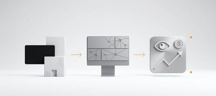
Need an professional logo or effective website for your company?
Check out our offer for a construction company website and contact us.
FAQ - Frequently Asked Questions
1. Why does a construction company need a professional logo?
A professional logo builds brand recognition, earns customer trust, and distinguishes the company from competitors.