


MarketingTips
Advertising Slogans for Real Estate Developers - 108 inspirations
...
A logo builds recognition, attracts customers and sets you apart from the competition. Here you will find a guide to designing a property development logo.

If you are a real estate developer, you may be wondering how to create a logo for your company or property development that is perfect and easily memorable. To answer this question, take a look at the examples of well-known brands such as Nike or McDonald's.
When someone asks you to recognize the logos of these brands, you will probably be able to do so without hesitation. But what makes that simple "swoosh" or golden arches so recognizable?
When it comes to your property development, it's worth taking care of the logo design. According to an article published on crowdspring.com, a brand's logo has only 10 seconds to make a first impression. However, a customer needs to see the logo five to seven times to recognize it.
Your development's logo will distinguish your community, identify your values, can attract attention and leave a lasting impression. If you are a real estate developer involved in property development, you know very well how important it is to effectively design a property development logo. That's why you are in the right place! Here are our 6 tips for designing a property development logo that will help you attract the right customers and build a strong property development brand!
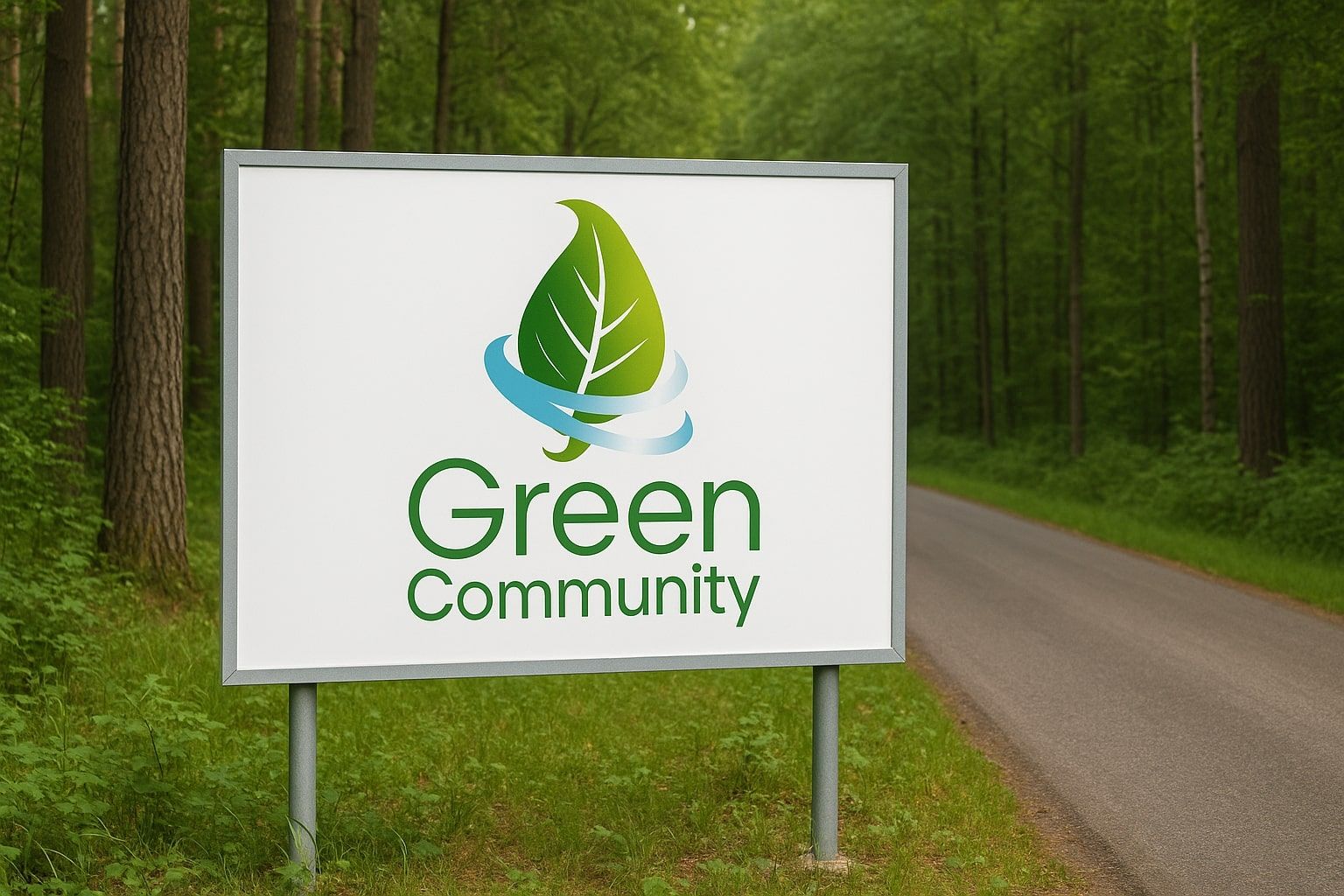
It can be tempting to create a complicated and elaborate apartment logo because you think it will stand out in the market. But in reality, customers always respond positively to the "less is more" approach. They remember simple logos, and simple designs tend to stand the test of time.
Creating simple logos is more difficult because they practically tell the whole story of your brand through one very clear visual element. An example would be Apple's simple, clear logo in the shape of an apple - quite effective and memorable, right? So take the time to define exactly what is important to your brand identity and create a well-thought-out, clean design.
![]()
To start, think about what information you want to convey about your investment - should it be luxurious and exclusive, elegant and modern, or rustic and organic? Should the investment have the feel of a renovated townhouse or a modern skyscraper?
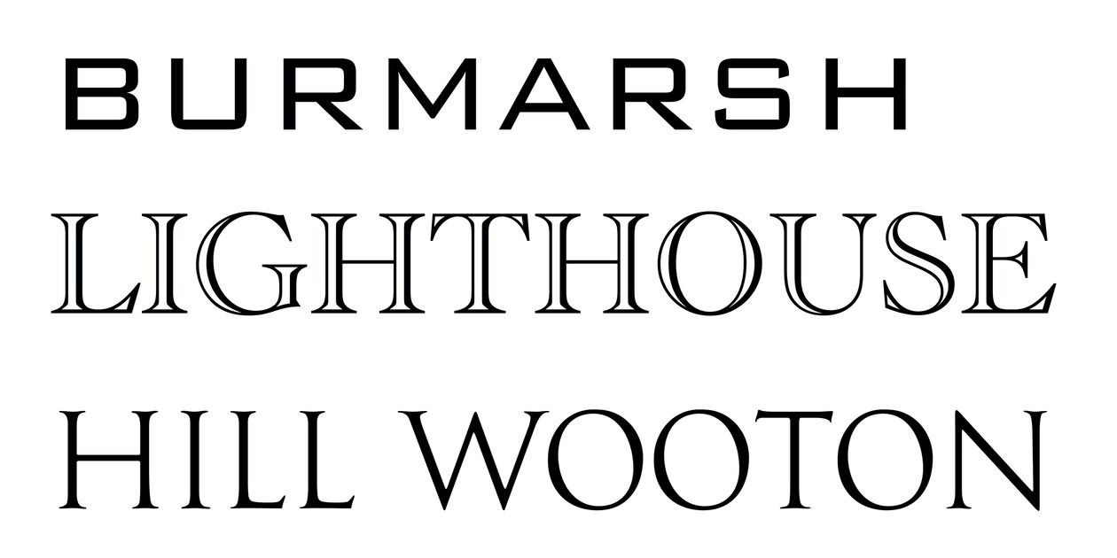
Once you've determined your style, choose a font that fits it. Legibility is key - don't go for overly fancy fonts that will make it difficult for the audience to receive the message.
It's a good idea to stick to one or two different font styles that will work well together. More styles can make the logo look disorganized and confusing (don't forget the first rule about logotype simplicity!).
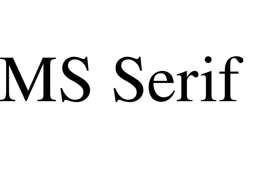
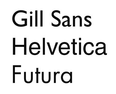
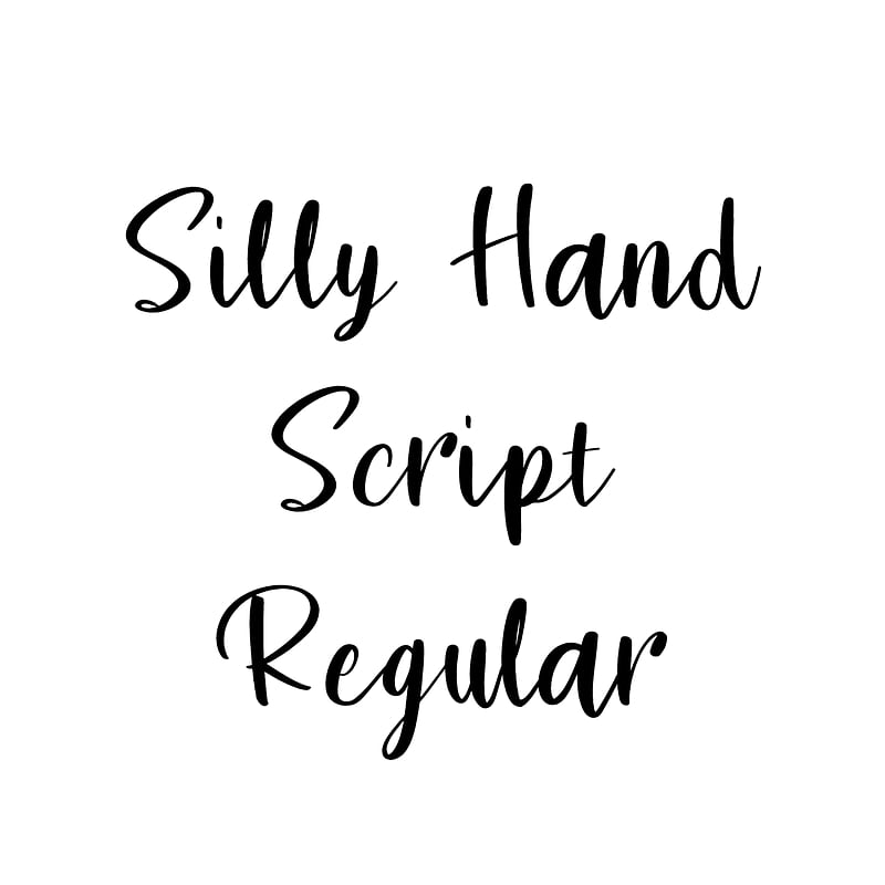
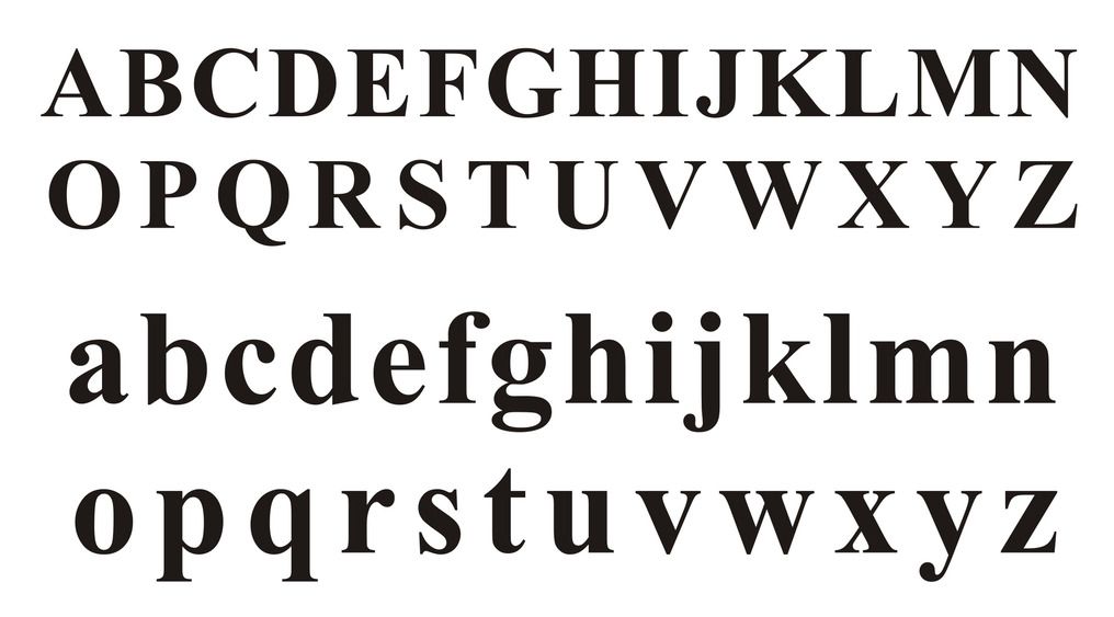
We also recommend using more traditional fonts instead of trendy ones. The main types of fonts include: Serif, Sans Serif, Display, Script and Modern. Each font style has its own psychology - that is, each style can evoke certain feelings or emotions in potential customers.
Based on the list above, choose those features that best describe your development, and then match the appropriate logo font for your development project.

Don't choose a color just because you like it - it should also fit your brand and be visually appealing. Color is the first element that attracts potential customers and can improve the readability of your real estate development logo.
According to colormatters.com, 60% of people make brand choices based solely on color, and a distinctive color increases brand recognition by 80%.
For example, you can spot the red and gold letter M in the McDonald's logo or the green Starbucks logo from a distance, even driving on the highway, right?
It's important to remember that each color has its own meaning and evokes specific feelings and inspires specific actions in consumers. Study the psychology of colors and decide how you want potential buyers to react to your logo.
The most common colors used in logo designs are:
You can take inspiration from major brands that use these colors or try something unique for your brand. Here's a quick guide to color psychology to consider when choosing the right color for your real estate development logo design:
When designing a logo for a real estate development project, it's also a good idea to consider market trends. It is important to use colors that will remain relevant even in the future, regardless of passing trends (for example, neon pink was fashionable in the 1980s and has recently gained popularity, but how long will it remain popular?).
As a developer, you should limit the number of colors in your logo to a maximum of three, although we strongly recommend focusing on two. The most successful logo designs are often based on a minimalist approach that fits in with the aesthetics of modern developments.
With the real estate development industry in mind, we want to create a logo that represents the investment in an attractive and professional manner. Choosing the right colors is important, as they can affect the emotions of potential customers and create positive associations with our brand.
Humans process visual images faster than text alone, which is why so many logos include symbols or characters along with the brand name. Some larger brands even dispense with text and use only the symbol (like Apple). In today's digital world, symbols are especially important for effectively communicating the core message to our audience.
Examples:
![]()
A logo book or brand book of logos will contain all of the pertinent details of your real estate development logo, so you can ensure consistency of message in all of the marketing materials you create. This guide will include the pantone colors used, the exact size specifications, the fonts used, and other relevant details about the logo. You will then be able to pass this guide on to any designer, and he or she will be able to perfectly reproduce the logo's color scheme in the material in question.
Your real estate development's logo is arguably the most important part of building your brand identity. All of your future marketing efforts will be based on it, so it's important to get it right from the start (no excuses!).
A logo is the brand’s business card – it differentiates it from the competition and builds recognition. In the real estate industry, where trust and professionalism are crucial, a unique logo emphasizes credibility and the prestige of the investment.
Start with a thorough analysis of the company’s identity: its mission, values, and target group. Then define the feelings the logo should evoke (e.g., solidity, innovation, elegance) to help guide the choice of shapes and colors.
Yes, but with moderation. Current trends can offer interesting ideas, but relying too much on fashion can cause the logo to become outdated quickly. It’s best to aim for a timeless design with a modern touch.
Very important. Simple forms are more memorable and versatile (from business cards to large-format banners). A minimalist logo is easier to adapt across various contexts and promotional materials.
Colors have strong psychological effects. Greens suggest ecology and calmness, blue tones convey trust and professionalism, while black or navy blue represent luxury and prestige. A well-thought-out color palette supports the desired brand image.
These include architectural elements (building outlines, rooftops, towers), construction-related motifs (bricks, tools), or symbols of stability and growth (arrows, trees). The key is that the symbol fits the brand's identity and isn’t overly literal.
Yes, the type of font (serif, sans-serif, geometric) influences brand perception. Solid, elegant typography may highlight prestige, while modern and simple fonts signal innovation. Typography should complement the overall design.
Use a limited number of graphic elements and colors. The principle "less is more" works well for real estate logos, where too many details can distract and reduce memorability.
The name should be legible, easy to remember, and reflect the company’s character. Developers often combine surnames, location names, or values the company wants to promote (e.g., “GreenPark” emphasizes eco-solutions and proximity to nature).
Definitely. Analyzing competitors and potential client preferences helps avoid repeating common designs and provides a benchmark for creating a logo that stands out among other real estate developers.
The logo is the foundation of visual identity. It should align with the color scheme of advertising materials, the website, or corporate merchandise. This gives the brand a cohesive and professional image.
Focus primarily on their portfolio – do their past projects meet your aesthetic and quality expectations? Clear communication, agreed-upon goals, scope, and deadlines are also essential.
It’s best to design the logo in vector format so it can scale without losing quality. It’s also useful to have color variants (reverse, monochrome) and vertical/horizontal versions for different uses.
Not always. A tagline can clarify what the company does or highlight its unique value proposition. However, if the brand name is clear enough, an additional tagline may be unnecessary.
Gather a few versions from the designer and show them to your target group, coworkers, or friends. You can also run an online survey to gather first impressions or feedback on legibility.
It can, if it aligns with the company’s vision. Developers often use local references (city names, regional symbols) to attract local interest. However, keep long-term universality in mind if expansion beyond the area is planned.
Check trademark databases to see if a similar logo or name already exists. If someone has registered rights, the design must be modified. This protects the company from potential legal disputes.
Overloading with details, using overly generic symbols (like overly complex building silhouettes), illegible typography, or lack of alignment with brand image. Using photos in a logo is also a mistake, as it hinders scalability.
Not necessarily. Rebranding can mean refreshing the existing logo (e.g., simplifying shapes, changing color or font). This evolution maintains brand recognition while introducing modern elements.
Depending on the project complexity and number of revisions, it can take from several days to a few weeks. The process includes research, initial concepts, design, client consultations, and final refinements.
Prices vary depending on the designer or agency’s experience and the project scope (concepts, brand book, logo versions). Costs can range from a few hundred to several thousand USD, but the investment usually pays off quickly.
It’s possible, but there’s a risk the result will look amateurish. DIY attempts can be a good starting point, but for a real estate developer, where trust and a professional image are crucial, hiring an experienced specialist is recommended.
The key is a timeless design. Avoid overly trendy solutions and unnecessary complexity. A subdued, professional style increases the chance the logo will remain relevant for years.
Not necessary. A logo should serve as a symbol and point of recognition, not a full description. Trying to include too many elements can create clutter. Business details can be communicated through marketing materials.
Announce the change across all channels: on the website, social media, and printed materials. It’s also worth preparing a short explanation about why the logo is changing and what vision it reflects. This helps customers connect with the new brand image.
Book a free consultation.
Sign up now for our free RendProletter and receive 1 email every week with a short summary of the best posts from our blog and emails with unique offers you won't find anywhere else!


